Above is a map of air contamination via dispersement of toxic chemicals from various waste incinerators around Jacksonville Florida. I chose this map because I am from Jacksonville and I found it very interesting to see this. As we learned, isopleths are used when we can't quite use classes or actual numerical depictions on our maps. An isopleth is a type of contour line that connects areas that have equal values. So, in the map above, the red line indicates areas around Jacksonville with equal amounts of the toxic chemical wastes. It can be helpful to use isopleths when we need to depict information more visually, like in this case, to show the "barrier." It also greatly helps in making correlations about the damage that these toxic waste incinerators are doing.
Map Analysis
Saturday, April 23, 2011
Range Graded Proportional Circle Maps
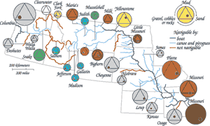
Range graded proportional circle maps are an easy way to show a lot of data at once. Not only do we get to see the data in the traditional proportional circles, larger size, larger data numbers, we get to see data within those circles as well. The images in the circles represents a range of data that each of the individual circles fall into.
Unstandardized Choropleth Map
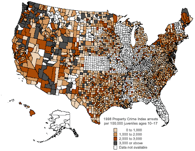
The above map is an example of an unstandardized choropleth maps. With this map type, the raw data is taken and then put straight into the maps. This map can sometimes be misleading in that it doesn't take into account things that could skew the results. For instance, areas in California have a lot more juvenile aged people than say, Kansas, so this map isn't exactly representative of the real numbers. It makes it look like there aren't any crimes for juvenile ages in the midwest, while there are a ton in the west. It is just generally better to standardize the maps in order to have a more reliable product.
Standardized Choropleth Map
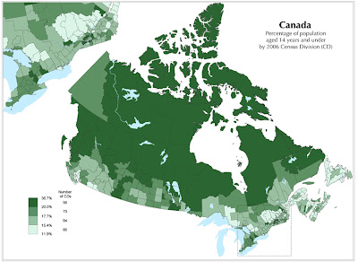
Standardized choropleth maps are good to use because they make sure that the data is presented in the most efficient and accurate matter. They use constant methods for dividing the classes so that the classes are represented accurately. Above, we have a map of Canada made during the census to look at populations of people 14 and under. Because this map is standardized, we can be assured that the data is accurately portrayed and set up into equal classes.
Star Plot
When we have a multivariate data set, star plots are handy in giving us a way to analyze all of the various data. All of the data start off in the center and move outwards depending on what the data shows. The map above looks at a star plot for various vehicles released in 1979. The differences in angle between the line give us information about the various variables in our data.
Correlation Matrix
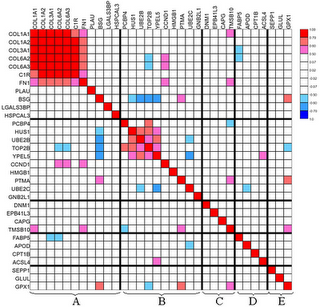
A correlation matrix is a matrix in which a correlation is made between all pairs in a data set. It works to compute the correlation between the various columns.
Similarity Matrix
Here is a similarity matrix. In all of its confusion, these maps allow us to express similarity between two data points. Higher scores are given to data with higher similarity and vice versa. In my reading, I learned that these are frequently used to line up DNA sequences, done based off of similarity.
Subscribe to:
Posts (Atom)


