Thursday, March 24, 2011

PLSS


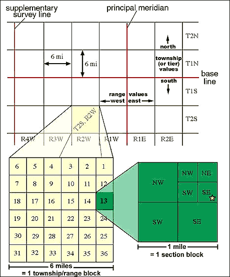
This map is an example of a PLSS map. It is a type of land survey that we learned about back in week four. PLSS is a partitioning system that covers much of the United States. One thing that is different from  about this form of partitioning is that it relies more on description and less on accuracy. It allows us to have a quick approximation of a location.  The system starts with a large block made up of townships, we can then enter into a one mile block within those townships to see how the land is divided in those places. Once we are inside this one mile block, land can be partitioned very unequally. However, when we are all the way "zoomed out" we have one block of a six mile area. PLSS is set up with a principal meridian for which everything is referenced from. These types of maps help us to get a general idea of the land and, when we get closer in to these townships, see how smaller plots of land are divided. Though less accurate, PLSS greatly helps in getting a general idea of ownership. 

Wednesday, March 23, 2011

Climograph


Climographs work to show us a couple of different things at once. They show us the amount of precipitation and the temperature for each month of the year. They allow us to make correlations between temperature and rainfall. The note at the bottom of this map also helps us make our correlations in that we can see if the things we are seeing in the climograph differ from the averages. In this map, we see the amount of precipitation and temperature for Los Angeles, California. We see that the temperature stays somewhat the same throughout the year with minor fluctuations in the winter season. As far as rainfall goes, Los Angeles receives a relatively decent amount of rain in the winter and spring months, but as soon as summer hits, they receive virtually none. Since the humidity out west is very low, it makes sense that the summer months, the most dry, would receive the least amount of rain. Usually with these maps, there is a correlation between rainfall and temperature, but here, there doesn't seem to be. Altogether, these types of maps work to show us correlations between rain and temperature that can help us better understand weather patterns. 

Proportional Circle Map


This map is an example of a Proportional Circle Map. Here, different sized circles are used to represent variables in a map. For this example, the circles represent the number of Mexican people residing in different states in the Unites states. Obviously, the bigger the circle, the larger the population. Knowing that, we can see that the states of Texas and California have the largest populations. This makes sense, since these states are in close proximity to the country of Mexico. Maps like this make it easier for us to visualize the information that is being presented. They are very simple and basic, nothing extravagant, no lines or confusing legends, just circles that make it very easy to interpret the information. 

Hypsometric Map


This map is known as a Hypsometric map. In this type of map, elevation is depicted through visible relieve and different types of shading. For instance, looking at this map, if we could actually touch it, it wouldn't feel smooth, it'd be bumpy and rigid to show how the elevation changes. This map is of British Columbia in Canada. We can see that the areas that are shaded in the pale green and green are the lowest elevations, they are around sea level. There are some parts of the map that are purple in color, these, according to the legend denote areas of the highest elevation. There are also a couple of numbers around the map that show us specific elevations at those points. These maps are extremely helpful in looking at an area as a whole and how it changes. The combination of the shading and the relief on the map do a lot to help us understand how our land is really set up. It allows us to separate ourselves from the flat maps of atlases. A lot of times, we look at those maps and forget that the land actually has some elevation changes. 

Isobar Map


This map is an example of an isobar map. It works to show us pressure differences in our atmosphere. This type of map is highly useful in that it helps us to predict the weather that may be coming. For instance, if we see a low pressure system coming, we could predict that we may have rain coming. This is because low pressure systems move air up which can lead to cloud formation and precipitation. On an isobar map, the lines that we see work to connect all areas of equal pressure. Lines that are closer to each other represent a rapid change in pressure, while lines that are further away represent a gradual pressure change. In this map, we see a low pressure system moving in the northern part of the country and up into Canada. Since gases move from areas of high pressure to those of low pressure, we can explain why the isobars are very close together around the low pressure zone. All the air from the high pressure zone to the south east is rushing into this system. The air will then be rushed upwards where clouds will form. This rapid change in pressure around the low pressure area will definitely bring some interesting weather since the air is moving so quickly. These types of maps are known to be used most by weather men and meteorologists to help them predict the weather we may experience. 

Tuesday, March 22, 2011

LIDAR Map of Kansas City, MO

LIDAR Link

This map is a LIDAR image of the city of Kansas City. We learned about the process of LIDAR in our remote sensing lesson in week nine. LIDAR, as stated in the notes, stands for Light Amplification by Simulated Emission of Radiation. In this process, a laser is used and shot down to the surface of the earth to help us pick up on depth of things. This would explain why we can see the buildings in what looks to be 3D. The laser is able to conform around the objects and project back an image that shows depth. This process, as we learned, is known as an active remote sensing method. As we can see, this map does a great job of showing us details of the city. IF it were done in SONAR or RADAR, the amount of detail in three dimensions wouldn't be there.